Podcast:
For many, the kitchen is the undisputed heart of the home—a hub of nourishment, conversation, and daily ritual. Yet, it can often feel more like a cramped cave than a welcoming command center. Dim lighting casts long shadows over countertops, surfaces disappear under an avalanche of appliances and mail, and the walls seem to close in, creating a palpable sense of confinement. The conventional solution—a full-scale, wall-demolishing renovation—is a costly, disruptive, and often impractical dream.
However, a dramatic kitchen transformation does not require a sledgehammer. It demands something far more subtle and powerful: the art of illusion. This report serves as a masterclass in five foundational design principles that work in concert to trick the eye, manipulate perception, and cultivate a profound sense of light and space. These are not mere decorating tips; they are strategic interventions grounded in psychology and physics, designed to deliver maximum impact with minimal investment and disruption. They are accessible to everyone, from the long-term homeowner on a budget to the renter bound by the terms of a lease.
By exploring these five interconnected pillars, anyone can learn to become a spatial illusionist, wielding simple tools to achieve extraordinary results. The journey begins with the foundational act of curating the space through The Art of the Edit. From there, it moves to understanding The Psychology of Palette, where color scientifically alters our perception of size and distance. Next, Let There Be Light reveals how to master layers of illumination to banish shadows and create warmth. This is amplified by The Power of Reflection, a guide to turning kitchen surfaces into a light-bouncing machine that manufactures an illusion of depth. Finally, Think Vertically teaches the crucial skill of drawing the eye upward, creating a sense of grandeur while reclaiming valuable horizontal space. Together, these principles form a holistic philosophy for transforming any kitchen—no matter how small or dark—into an airy, luminous, and inspiring haven.
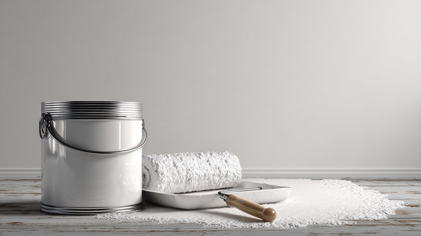
The Art of the Edit: Strategic Decluttering for Visual Serenity
The process of making a kitchen feel more spacious begins not with adding something new, but with taking things away. This is more than just tidying; it is the foundational design act of strategic decluttering. It involves reframing the goal from simply cleaning up to intentionally curating the environment to achieve what designers call “visual quiet”. This state of reduced visual noise is the essential canvas upon which all other brightening and expanding illusions are painted. It is about creating calm, improving workflow, and allowing the architectural lines of the room to breathe.
The Philosophy of the Purge: From Hoarder to Curator
Before any organization can begin, a thorough and honest purge is necessary to set the stage. This initial edit is a critical step in adopting the decluttering mindset required to liberate a kitchen from its excess. The most effective method is to gather every portable kitchen item and sort it into three distinct piles: keep, donate/sell, and discard. This process forces a direct confrontation with every object, from the novelty cookie jar to the third set of measuring spoons.
A simple but powerful psychological framework can guide these decisions: if an item has not been used in the past year, it is a prime candidate for removal. This rule is especially potent when dealing with duplicates. While a large kitchen might accommodate five spatulas, a small one cannot afford that luxury. The goal is to keep only the single, best-quality version of each tool and let the rest go, a move that can instantly free up surprising amounts of drawer and cabinet space.
To maintain momentum and avoid feeling overwhelmed, an “easy to hard” strategy is highly effective. Beginning with obvious trash—such as expired food, broken utensils, or mismatched plastic containers—provides an immediate sense of accomplishment. This initial success builds the motivation needed to tackle more emotionally charged or difficult decisions later, transforming the daunting task of decluttering into a series of manageable victories.
Countertop Curation: The ‘Visual Quiet Zone’
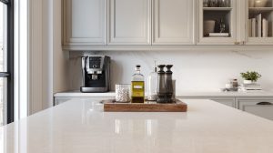
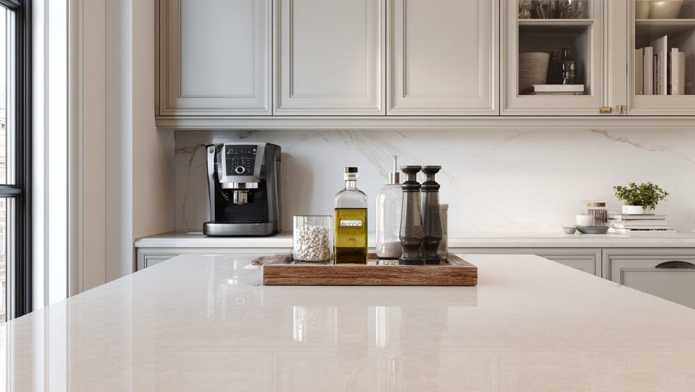
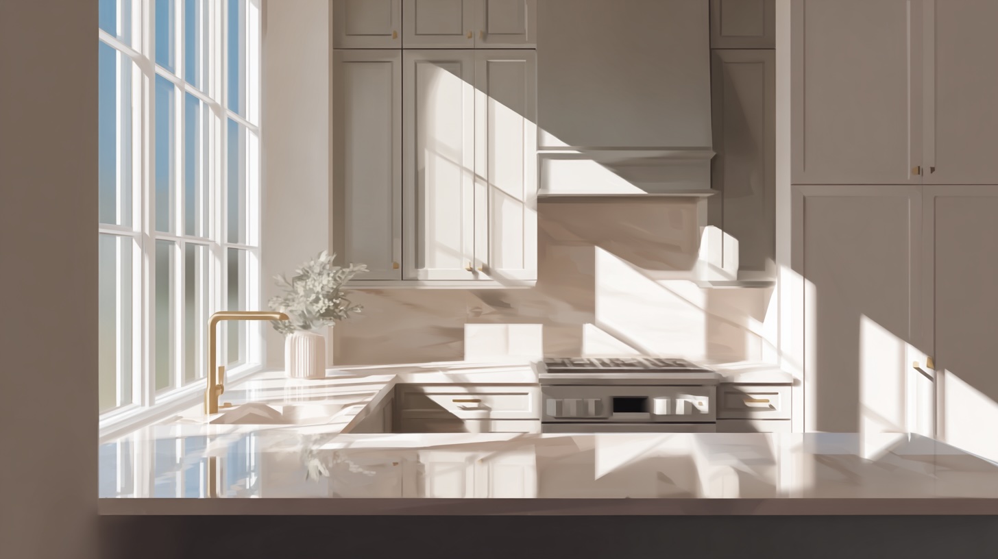
The kitchen countertop is the most visible horizontal surface in the room, and its state dictates the overall feeling of the space. A cluttered counter makes a kitchen feel chaotic and small, while a clear one creates an immediate sense of openness and order. The golden rule, as articulated by interior designer Rachel Blindauer, is that “daily-use appliances (like your coffee maker or blender) should live on the counter only if they get used every day”. Every other item, from the stand mixer to the toaster, must earn its place in a designated, hidden home.
This practice establishes a “visual quiet zone”—an intentionally uncluttered expanse that allows the mind to rest. This is not merely about creating physical space for food prep; it is about reducing the cognitive load that comes from a visually chaotic environment. A countertop that bombards the brain with disparate shapes, colors, and textures creates a low-level, constant state of disorder. By ruthlessly editing what is visible, one engineers a serene environment where the eye can travel uninterrupted across surfaces, a key factor in perceiving a space as larger and more peaceful.
For the few essential items that must remain on the counter—such as a bottle of olive oil, a salt cellar, and a pepper mill—a simple designer trick can transform them from clutter into a curated vignette. By grouping these items together on a small tray or a beautiful cutting board, they are corralled into a single, intentional visual unit. This simple act imposes order and purpose, elevating everyday objects into a thoughtful display.
Cabinet and Drawer Mastery: The Boutique Closet Method
The principles of curation must extend behind closed doors, especially into upper cabinets that are frequently in one’s line of sight. The “boutique closet” approach treats these storage spaces with the same care as a high-end retail display. This involves practical upgrades like installing adjustable shelving to maximize vertical space and decanting dry goods like pasta, rice, and flour into uniform, clearly labeled glass jars. This strategy creates a sense of visual harmony and order that contributes to an overall feeling of calm, even when the cabinet doors are open.
Within drawers, the quality of organizational tools directly influences the sustainability of the system. Flimsy, ill-fitting plastic dividers create friction and frustration in daily use; when putting a utensil away becomes an annoying task, the system inevitably breaks down and clutter returns. Investing in well-made wood, bamboo, or custom-fit acrylic inserts is what designer Rachel Blindauer calls a “small luxury that pays dividends in calm”. A high-quality organizer provides a smooth, satisfying experience, and this positive reinforcement encourages consistent use, transforming the act of organizing from a one-off project into a sustainable daily ritual.
For deep cabinets, the “one-deep” storage principle is paramount. This means arranging items so that nothing is hidden behind another, ensuring every item is visible and easily accessible. This prevents the common problem of forgotten items languishing in the dark recesses of a cabinet. For notoriously awkward corner cabinets, a simple lazy susan is a game-changing solution, allowing full access to the entire space with a simple spin.
Renter-Friendly Focus: The Non-Permanent Toolkit
Many of the most effective organizational strategies require no permanent alterations, making them ideal for renters. A freestanding rolling utility cart or a baker’s rack can serve as a mobile island, providing valuable extra storage and prep space that can be positioned as needed or taken to the next home. Another powerful tool is an over-the-sink workstation. These clever inserts, which can include a drying rack, a colander, and a cutting board, effectively expand the functional workspace of the kitchen without increasing its physical footprint, a perfect solution for compact layouts.
The Psychology of Palette: Painting Your Way to a Larger Space
Color is one of the most powerful and cost-effective tools for transforming the perception of a room. It is not merely a decorative choice; it is a psychological and physical tool that can manipulate our sense of space, light, and mood. By understanding the science of how color interacts with light and how our brains interpret it, one can strategically “paint” a small kitchen to feel significantly larger, brighter, and more open.
The Science of Spatial Perception: How Color Tricks the Eye
The core principle behind using color to expand a space lies in a property known as Light Reflectance Value, or LRV. Every color has an LRV rating on a scale from 0 (absolute black) to 100 (pure white), which indicates how much light it reflects. Lighter colors have a high LRV, meaning they bounce more of the available light around a room, which makes the space feel brighter, more open, and more airy.
Beyond light reflection, colors also have perceived “weight” and “distance.” Cool tones—such as blues, greens, and cool grays—are known as receding colors. They visually pull back from the eye, making the walls on which they are painted feel farther away and thus expanding the perceived dimensions of the room. Conversely, warm tones—like reds, oranges, and deep yellows—are advancing colors. They appear to move toward the viewer, which can create a wonderful sense of intimacy and coziness in a large room but can make a small room feel more enclosed.
The Power of White: A Nuanced Approach
White is the classic, go-to choice for small spaces for good reason—it has the highest LRV and reflects the most light. However, the world of white paint is vast and nuanced, and the key to success lies in selecting the correct undertone for the specific conditions of the kitchen.
- Warm Whites: These whites contain subtle undertones of yellow, cream, or soft beige. Popular examples include Benjamin Moore’s Simply White OC-117, White Dove OC-17, and Cloud White OC-130, as well as Sherwin-Williams’ Alabaster SW 7008. Warm whites are the ideal choice for kitchens that receive limited natural light or have a north-facing orientation. In these conditions, a pure, cool white can look sterile and cold, but a warm white will infuse the space with a soft, welcoming glow.
- Cool Whites: These whites have subtle undertones of blue, green, or gray. Standout examples are Benjamin Moore’s Chantilly Lace OC-65 and Decorator’s White OC-149. Cool whites create a crisp, clean, and modern aesthetic. They are best suited for spaces with abundant, warm southern light, which balances their coolness and allows their clean character to shine without appearing stark or clinical.
The final perceived color in a room is a dynamic interplay between three crucial elements: the paint’s inherent undertone, its finish or sheen, and the specific quality of both the natural and artificial light in the space. A warm white paint with a yellow undertone, for instance, will appear much more yellow when rendered in a high-gloss finish and illuminated by warm, low-Kelvin light bulbs. The same paint in a matte finish in a room with cool, north-facing light might look perfectly soft and creamy. Therefore, selecting the right color requires a holistic calculation of how these three factors will interact in a particular environment.
Beyond White: Sophisticated Hues for an Expansive Feel
While white is effective, it is far from the only option. Several other color families excel at creating a sense of space while adding more personality and depth.
- Dusty Greens & Pale Blues: Soft, muted shades like Sherwin-Williams’ Sea Salt SW 6204 or Benjamin Moore’s Wythe Blue HC-143 are excellent choices. These colors are what designers refer to as “mid-value, low-contrast, and slightly muted, so they recede visually”. They evoke a sense of nature, calm, and serenity, lending an airy quality to the room that enhances the feeling of spaciousness.
- Mushroom, Taupe, and Greige: Complex neutrals that blend gray and beige, such as Sherwin-Williams’ Accessible Beige SW 7036 or Realist Beige, offer a sophisticated alternative. Designer Lauren Saab explains that these “taupey mid-tones melt those boundaries so your eye glides uninterrupted, tricking the brain into reading more volume”. They provide warmth and a layered, modern feel without visually shrinking the space.
The Unifying Power of Monochromatic and Low-Contrast Schemes
One of the most powerful strategies for making a small kitchen feel larger is to minimize visual contrast. This can be achieved by using a monochromatic scheme, where walls, cabinets, and even the trim are painted in the same color, perhaps in slightly different sheens for subtle texture. A low-contrast approach uses colors that are very close in tone and value.
The psychological effect is profound. High-contrast elements, such as dark lower cabinets against bright white upper cabinets, visually “chop the room to pieces”. The sharp lines create defined boundaries that allow the brain to easily calculate the room’s compact dimensions. A low-contrast or monochromatic palette, however, “blurs the lines between the surface areas” and “melts those boundaries”. This creates a seamless visual envelope where the eye can move freely and uninterruptedly, making the kitchen appear more unified, cohesive, and expansive. This principle explains why an all-sage-green or all-light-gray kitchen can feel significantly larger than a high-contrast black-and-white one.
The Designer’s Neutral Paint Guide for Small Kitchens
To translate this theory into actionable information, the following table synthesizes recommendations from over a dozen design sources, providing a curated list of paint colors proven to work well in smaller kitchens.
|
Paint Name & Brand |
Undertone & Characteristics |
Ideal Lighting & Pairing |
Spatial & Psychological Effect |
|
White Dove OC-17 (Benjamin Moore) |
Soft, warm white with a hint of greige. Creamy and luminous without being yellow. |
Highly versatile. Excels in spaces with average to low natural light. Pairs beautifully with warm woods and brass hardware. |
Creates a welcoming, airy, and expansive feel. Avoids the starkness of pure whites, making the space feel open yet soft. |
|
Chantilly Lace OC-65 (Benjamin Moore) |
A crisp, clean white with very little discernible undertone. Considered one of the “purest” whites. |
Best in rooms with abundant natural light to balance its coolness. Pairs well with modern finishes like stainless steel and marble. |
Delivers a bright, modern, and gallery-like feel. Its high reflectivity maximizes light for a truly spacious look. |
|
Alabaster SW 7008 (Sherwin-Williams) |
A soft, off-white with neutral beige undertones. Provides warmth without being overly creamy. |
Excellent for north-facing rooms or those with less light. Complements both warm and cool tones. |
Makes a space feel bright but also cozy and inviting. A balanced choice that feels timeless and open. |
|
Sea Salt SW 6204 (Sherwin-Williams) |
A muted, chameleon-like color that shifts between green, blue, and gray depending on the light. |
Works well in a variety of lighting conditions. Pairs beautifully with crisp white trim and light wood tones. |
Evokes a serene, coastal, and airy atmosphere. The cool, receding nature of the color makes walls feel further away. |
|
Accessible Beige SW 7036 (Sherwin-Williams) |
A popular “greige” that balances beige and gray with warm undertones. |
Versatile and adaptable. Its warmth prevents it from feeling cold in low-light situations. |
Creates a sophisticated, unified, and warm space. The low contrast helps to blur edges and expand the room visually. |
Let There Be Light: Illuminating Your Kitchen Without an Electrician
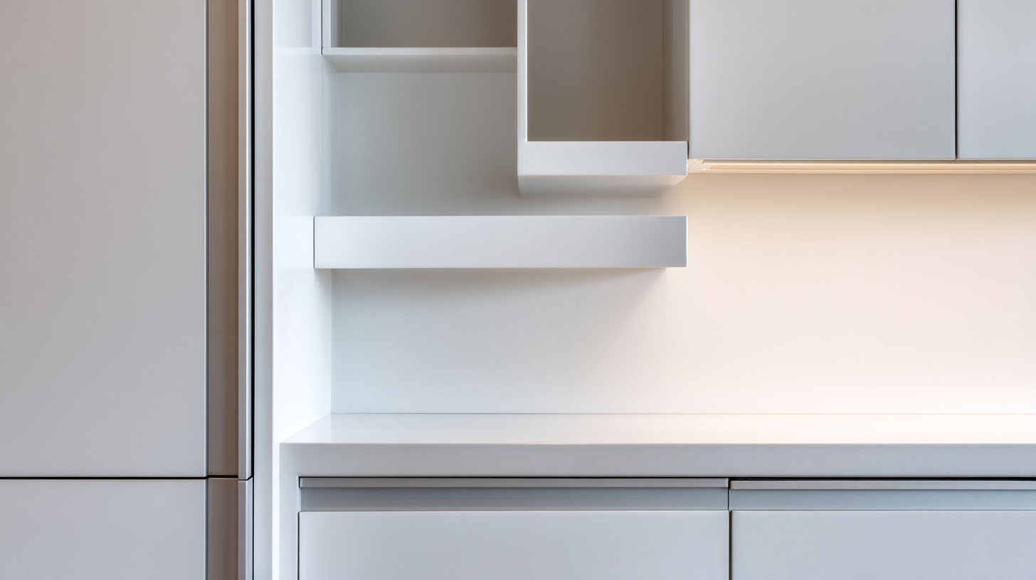
Lighting is the active force that animates every other design choice in a kitchen. A perfectly chosen paint color remains dull in a shadowy room, and a reflective surface cannot bounce light that isn’t there. Good lighting is the foundational energy source that powers the entire system of illusion. More than just making things visible, a strategic lighting plan is designed to accomplish a crucial goal: shadow elimination. Shadows define edges, corners, and planes, constantly reminding the brain of a room’s tight physical boundaries. By washing surfaces with even, diffuse light, those defining lines are effectively erased, and the kitchen feels more like a continuous, open volume. Fortunately, achieving this professional-level effect no longer requires an electrician.
The Three Layers of Light: A Professional Framework
Professional lighting design is built upon a simple framework of three distinct layers that work together to create a functional and inviting space.
- Ambient Light: This is the overall, general illumination of the room, typically provided by a central ceiling fixture. It is the foundation upon which the other layers are built.
- Task Light: This is focused, direct light aimed at specific work areas. In a kitchen, the most critical zones for task lighting are the countertops and the sink. It is the single most important layer for improving functionality and banishing shadows.
- Accent Light: This is directional light used to highlight architectural features or decorative objects, such as artwork or the contents of a glass-front cabinet. It adds depth, drama, and a finishing touch of sophistication.
The Easiest Upgrade: The Right Light Bulb
The most immediate and budget-friendly lighting upgrade involves simply changing the light bulbs. However, success depends on understanding two key metrics that are more important than traditional wattage: lumens and Kelvin.
- Lumens (lm): This measures the bulb’s actual brightness. Watts measure energy consumption, but modern LED bulbs can produce far more lumens at a lower wattage than older incandescent bulbs. For a kitchen, look for bulbs with a high lumen output to ensure a bright space.
- Kelvin (K): This measures the color temperature of the light, from warm to cool. For a kitchen, the ideal range is typically between 3000K and 5000K. This range produces a clean, bright light that mimics natural daylight and renders colors accurately. Bulbs below 2700K can cast a yellow, dingy hue that makes even the cleanest kitchen feel dated, while bulbs above 5000K can feel overly blue and clinical.
Task Lighting for Every Budget: The Shadow-Buster
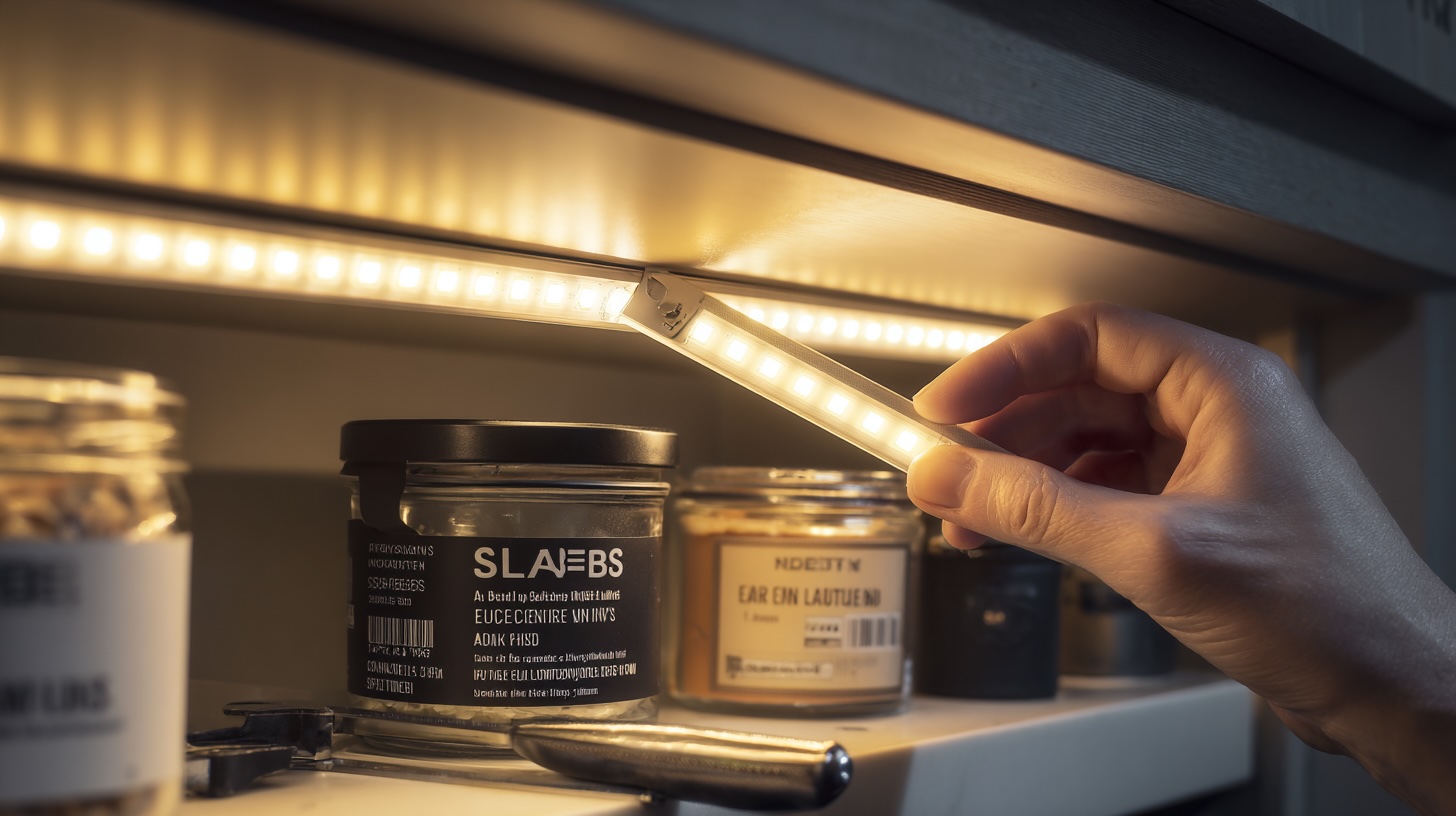
The shadows cast by upper cabinets onto the countertops are the primary culprits in making a kitchen feel dark and cramped. Under-cabinet lighting is the targeted solution, directly illuminating this crucial workspace and instantly making the entire kitchen feel brighter and more functional. A host of DIY, renter-friendly options make this upgrade accessible to all.
- Adhesive LED Light Strips: These are a versatile and popular choice. They come in a roll that can be cut to the exact length needed and feature a peel-and-stick backing for easy installation. They provide a continuous, even wash of light. For a professional-looking installation, wires can be hidden by drilling small holes between cabinets or using adhesive clips.
- Battery-Operated Puck Lights: This is the simplest solution of all. These small, round lights can be attached anywhere with adhesive tape, making them perfect for targeting small, dark areas without any wiring. Many are now available with remote controls for convenience.
- Wireless Switches: For a truly seamless experience, many modern DIY lighting kits can be paired with a wireless, battery-operated wall switch. This switch can be mounted anywhere with double-sided tape, providing the convenience of a hardwired switch without any electrical work.
Creating Ambiance: Creative & Non-Permanent Fixtures
Beyond task lighting, several clever products can add layers of accent and ambient light without permanent installation.
- Clamp Lamps: These highly versatile fixtures are a designer’s secret weapon. As the name suggests, they can be clamped onto a shelf, a cabinet edge, or even a window frame to provide a focused beam of light exactly where it’s needed.
- Pendant Conversion Kits: This ingenious hack is a game-changer for renters with standard recessed ceiling lights (can lights). These kits feature hardware that screws directly into the existing light bulb socket. A cord then hangs down, allowing a stylish pendant lamp to be hung where there was previously only a flat recessed light. This simple, non-invasive process brings the light source down from the ceiling, creating a more intimate and better-lit zone over a kitchen island, peninsula, or sink.
Maximizing Natural Light: The Free Resource
The best light is free, and maximizing its presence is crucial. Heavy curtains and thick blinds absorb light and visually shrink a window opening. The ideal solution for both light and privacy is translucent or frosted window film. This self-adhesive film is easy to apply and remove, making it perfectly renter-friendly. It obscures the view from outside while allowing the kitchen to be flooded with soft, diffuse natural light all day long.
The Power of Reflection: Expanding Your Horizon with Light-Bouncing Surfaces
Once a kitchen is properly lit, the next step is to amplify that light. This is achieved by strategically using reflective surfaces that act as light-bouncing machines, creating a powerful illusion of brightness and depth. This strategy operates on two distinct levels: it physically multiplies the amount of light in the room, and it psychologically tricks the brain into perceiving a world beyond the physical boundaries of the walls. By weaponizing the simple physics of reflection, one can make a small kitchen feel dramatically larger and more luminous.
The Physics of the Bounce: An Illusionist’s Toolkit
The science is straightforward: dark, matte surfaces absorb light, while smooth, shiny surfaces reflect it. By incorporating materials that bounce light back into the room rather than absorbing it, the effects of both natural and artificial light sources are magnified. This simple act of light distribution can make a dim space feel brighter and a small space feel more expansive. A sophisticated design employs a hierarchy of reflectivity, layering different sheens to create a rich, textured environment rather than a flat, glaring one.
The Ultimate Trick: Strategic Mirror Placement
Mirrors are the most potent tool in the reflective arsenal. A single, well-placed mirror can visually double the size and light of a space. Placement is key to maximizing their effect.
- As a Backsplash: Installing a mirrored backsplash is a bold and highly effective move. It reflects the entire kitchen, creating a dramatic illusion of depth that can “make the room feel twice as large”.
- Opposite a Window: Hanging a large mirror on the wall directly across from a window is a classic designer trick. It captures the incoming natural light and the outdoor view, effectively creating a second window and flooding the room with brightness and a sense of openness.
- On a Blank Wall: Even in a kitchen without a convenient wall opposite a window, a large framed mirror can serve as a beautiful focal point. It breaks up a solid wall and creates the impression of another doorway or pass-through, adding perceived depth.
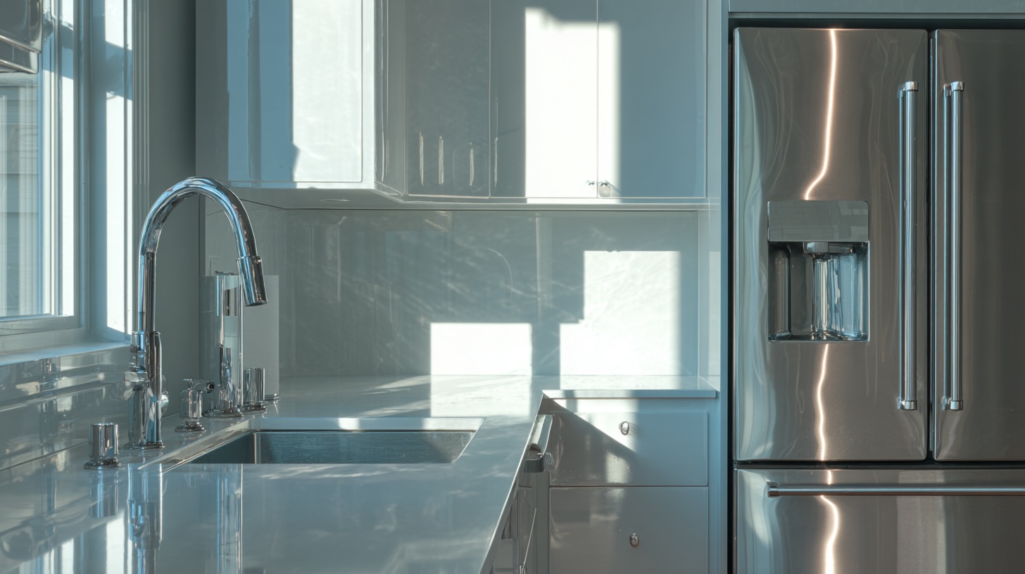
Glossy and Gleaming Finishes: The Sheen of Space
Beyond mirrors, the sheen of large surfaces plays a critical role in bouncing light. Opting for glossy finishes over matte ones can have a significant impact.
- High-Gloss Cabinetry: A coat of high-gloss paint or the use of materials like lacquered or high-gloss acrylic panels can transform solid cabinet doors into sleek, light-reflecting planes.
- Polished Countertops and Backsplashes: Materials like polished quartz, marble, or even glossy ceramic tiles have smooth, reflective surfaces that contribute to the overall brightness of the room. A simple white subway tile in a glossy finish will bounce significantly more light than its matte counterpart.
The Subtle Power of Metallics
Metallic elements introduce scattered points of reflection that add life, sparkle, and a subtle layer of brightness throughout the kitchen.
- Appliances: Stainless steel is a popular choice not just for its durability but for its reflective quality. A large stainless steel refrigerator or dishwasher acts as a diffuse mirror, dispersing light throughout the space.
- Hardware and Fixtures: The impact of small details should not be underestimated. Cabinet pulls, knobs, and faucets finished in polished chrome, polished nickel, or gleaming brass act like jewelry for the kitchen, catching the light with every movement and adding a subtle shimmer.
- Decorative Accents: Even small, utilitarian objects can contribute to the effect. A shiny chrome teapot, a copper utensil holder, or a collection of stainless steel canisters will catch and reflect light, adding to the layered, luminous feel.
The Role of Glass: Visual Transparency
Glass contributes to the illusion of space not by reflecting light, but by allowing the eye to see through it. Replacing solid upper cabinet doors with glass-front doors breaks up the visual mass of cabinetry, making the entire wall feel lighter and more open. This technique creates visual depth by allowing sightlines to extend to the back of the cabinet, making the wall itself seem farther away. For this to be effective, the contents of the cabinets must be kept neat and organized, turning everyday dishware into a stylish display.
Think Vertically: Maximizing Every Inch with Smart Storage
In any small room, floor and counter space are finite, precious resources. The most effective way to expand a kitchen’s capacity and perceived size is to look up. Utilizing vertical space is a powerful, dual-purpose strategy. Functionally, it gets bulky items off valuable horizontal surfaces, clearing the way for prep and daily tasks. Perceptually, it draws the eye upward, creating a sensation of height and grandeur that counteracts the cramped feeling of a small or low-ceilinged room. It is both a space-maker and a space-faker.
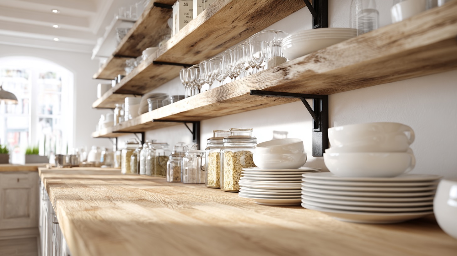
Wall-Mounted Wonders: Your Walls are Prime Real Estate
Walls should be viewed not as boundaries, but as untapped assets for storage and display. The most effective vertical storage solutions are not just added to the kitchen; they are integrated with its workflow and aesthetic, transforming utilitarian objects into deliberate design features.
- Floating Shelves: An elegant and modern alternative to bulky upper cabinets, floating shelves provide essential storage for dishes, glassware, or canisters while keeping the wall behind them visible. This enhances the perception of a larger area and prevents the boxed-in feeling that a solid bank of cabinets can create.
- Pot Rails and Magnetic Knife Strips: These are classic workhorses of the space-efficient kitchen. A simple rail mounted on the backsplash or under upper cabinets can hold utensils, mugs, and even small pots via S-hooks. A magnetic knife strip gets a bulky knife block off the counter entirely, turning functional tools into an organized, graphic display.
- Pegboards: A pegboard is the ultimate in flexible, high-capacity vertical storage. Highly customizable with an array of hooks, baskets, and small shelves, it can be configured to hold everything from pots and pans to spice jars and measuring cups. For renters, this is an ideal solution; the small installation holes are easily patched with a dab of spackle before moving out.
The Renter’s Toolkit: Damage-Free Verticality
Achieving vertical storage does not have to involve drilling. A powerful toolkit of renter-friendly products can unlock a wealth of space without leaving a trace.
- Magnetic Organizers: The exposed metal sides of a refrigerator are prime real estate. A wide variety of magnetic organizers are available, including spice racks, paper towel holders, and caddies for utensils, instantly creating storage out of thin air.
- Tension Rods: These incredibly versatile rods, which use spring-loaded tension to fit between two surfaces, require no tools or hardware. A small tension rod installed under the sink is perfect for hanging spray bottles by their triggers, freeing up the cabinet floor. A larger one can be placed across a narrow alcove to hang utensils or even lightweight pans with S-hooks.
- Over-the-Door Racks: A simple rack that hooks over the top of a pantry or kitchen door can instantly add multiple shelves of storage, perfect for spices, canned goods, or cleaning supplies.
- Adhesive Hooks: Modern adhesive hooks are strong, reliable, and remove cleanly. They are a renter’s best friend. Use them on the inside of cabinet doors to hang measuring spoons and cups, on a tiled backsplash to hold utensils, or on any smooth wall for pot holders and dish towels.
Unlocking Hidden Real Estate: The Nooks and Crannies
Every kitchen has small, awkward, and often-overlooked spaces that can be converted into valuable storage.
- Above the Cabinets: The space between the top of your upper cabinets and the ceiling is ideal for stashing large, bulky, or rarely-used items like serving platters, holiday-specific bakeware, or a stand mixer. To prevent this area from looking cluttered, store these items in attractive, uniform baskets or bins. This contains the visual chaos and creates a clean, intentional look.
- Sides of Cabinets: The narrow, exposed side of a cabinet run is a perfect spot for a slim magnetic knife strip, a few hooks for aprons, or a small, wall-mounted spice rack.
- Inside Cabinet Doors: The back of a cabinet door is a goldmine of storage potential. Mount slim wire racks to hold boxes of aluminum foil and plastic wrap, cutting boards, or spice jars.
Conclusion: Your New Kitchen Awaits
A kitchen that feels small, dark, and cluttered can be a source of daily friction, but its transformation is well within reach, requiring neither a significant budget nor a destructive renovation. The solution lies in a more nuanced understanding of design—a strategic application of principles that work in concert to create a powerful and pleasing illusion of light and space.
The journey begins with The Art of the Edit, a disciplined curation that establishes a foundation of visual calm by clearing countertops and organizing cabinets. This serene canvas is then brought to life by The Psychology of Palette, where low-contrast and light-reflecting colors are used to unify surfaces and visually push back the walls. This effect is ignited by Let There Be Light, a layered approach to illumination that banishes performance-killing shadows and creates a warm, inviting glow. The available light is then multiplied by The Power of Reflection, which uses glossy, metallic, and mirrored surfaces to bounce light and create an illusion of depth. Finally, the entire composition is given a sense of grandeur by Thinking Vertically, a strategy that draws the eye upward to create illusory height while simultaneously freeing up precious horizontal workspace.
These five principles are not isolated tips but an interconnected system. Light activates color; reflection amplifies light; decluttering provides the clean lines for light and color to work their magic; and vertical storage enhances the perception of it all. By embracing this holistic toolkit, anyone can become the architect of their own experience. A brighter, more spacious, and more functional kitchen is not a distant dream accessible only through demolition. It is an immediate possibility, waiting to be unlocked by a few smart, simple, and transformative changes. The result is more than just an aesthetically pleasing room; it is an enhancement to daily well-being, a space that reduces stress, fosters creativity, and truly feels like the joyful heart of the home.